Goat.
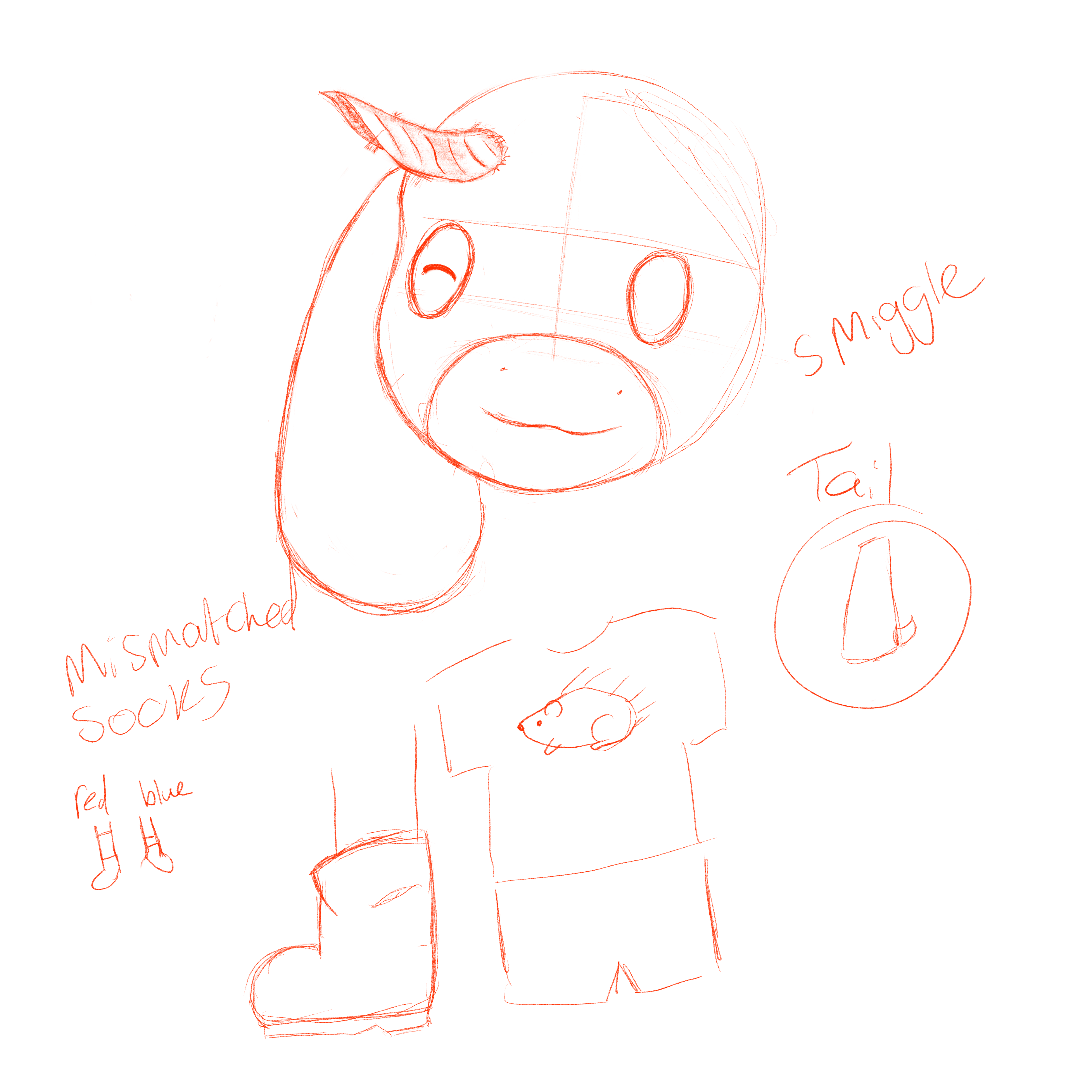
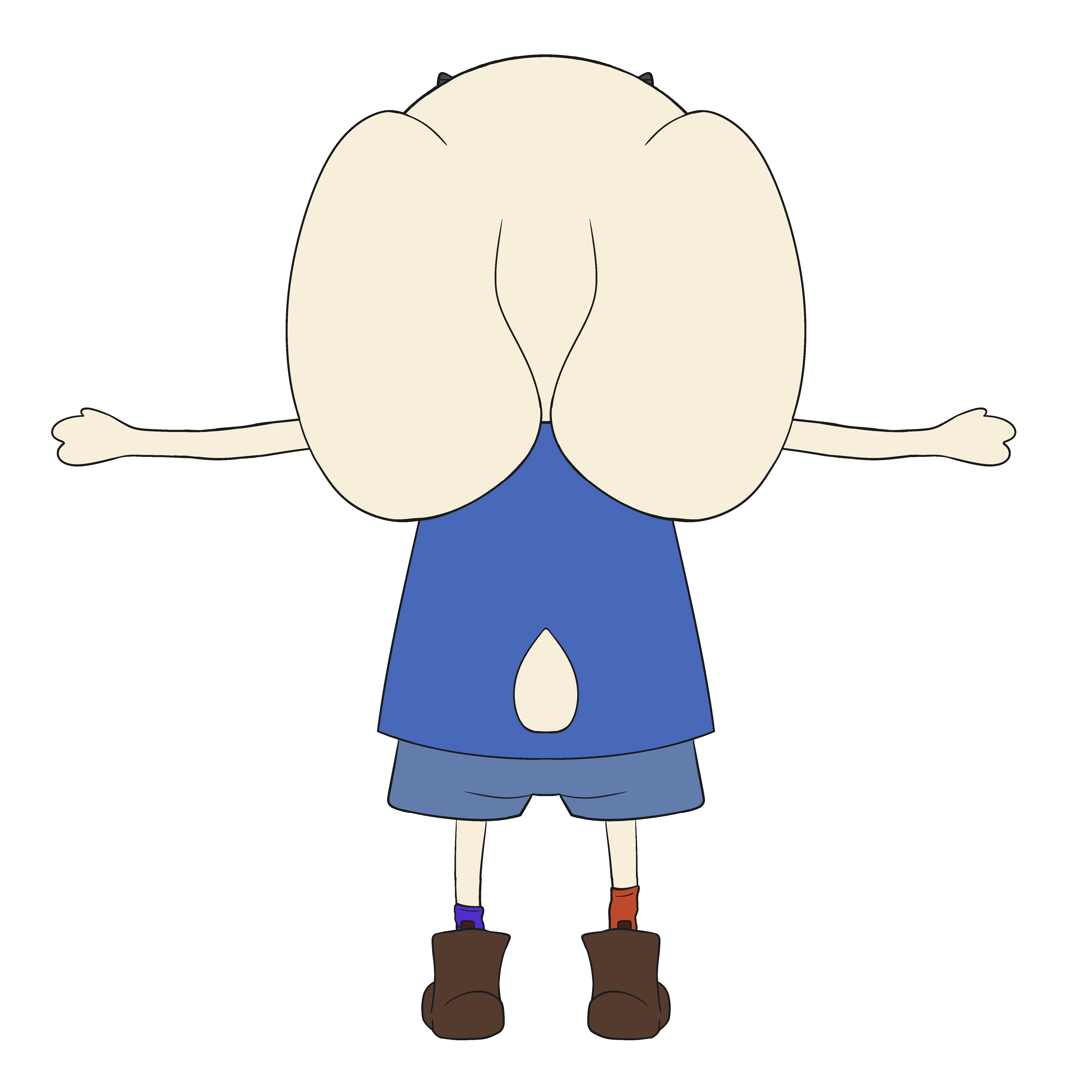
This is Smudge.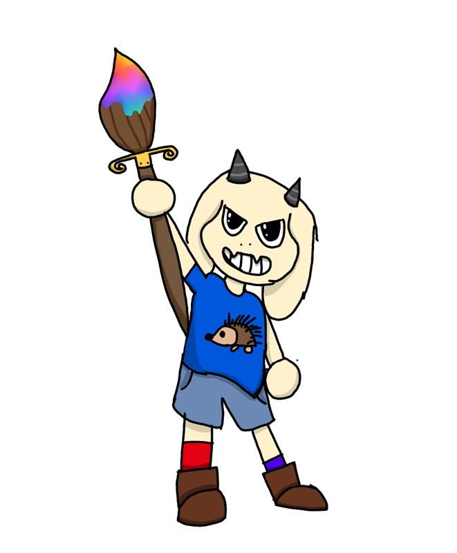
He's a Little Guy (tm).
This version of Smudge was created by Astra in 2025 for a game concept in college. I was tasked with "un-deltaruning" him.
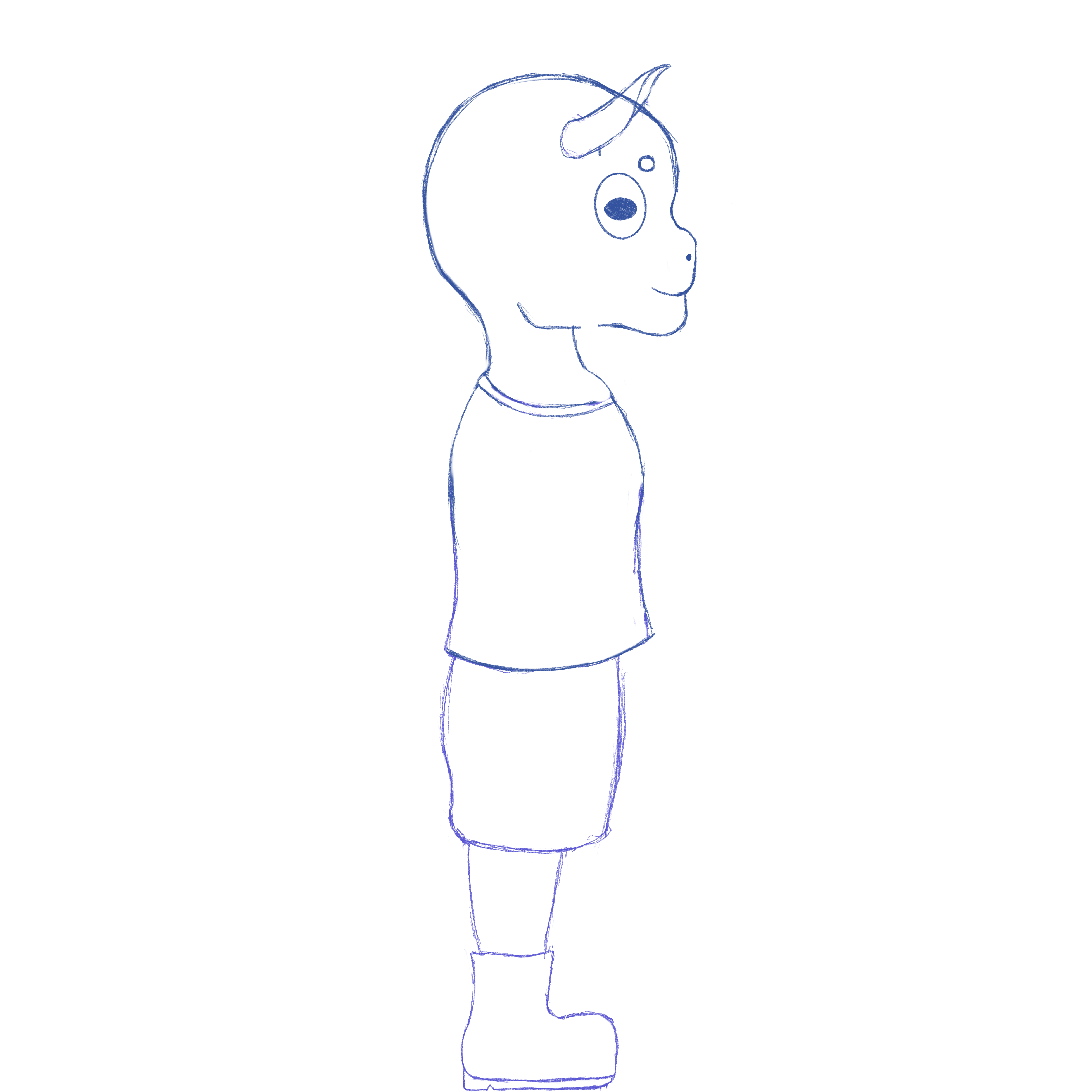
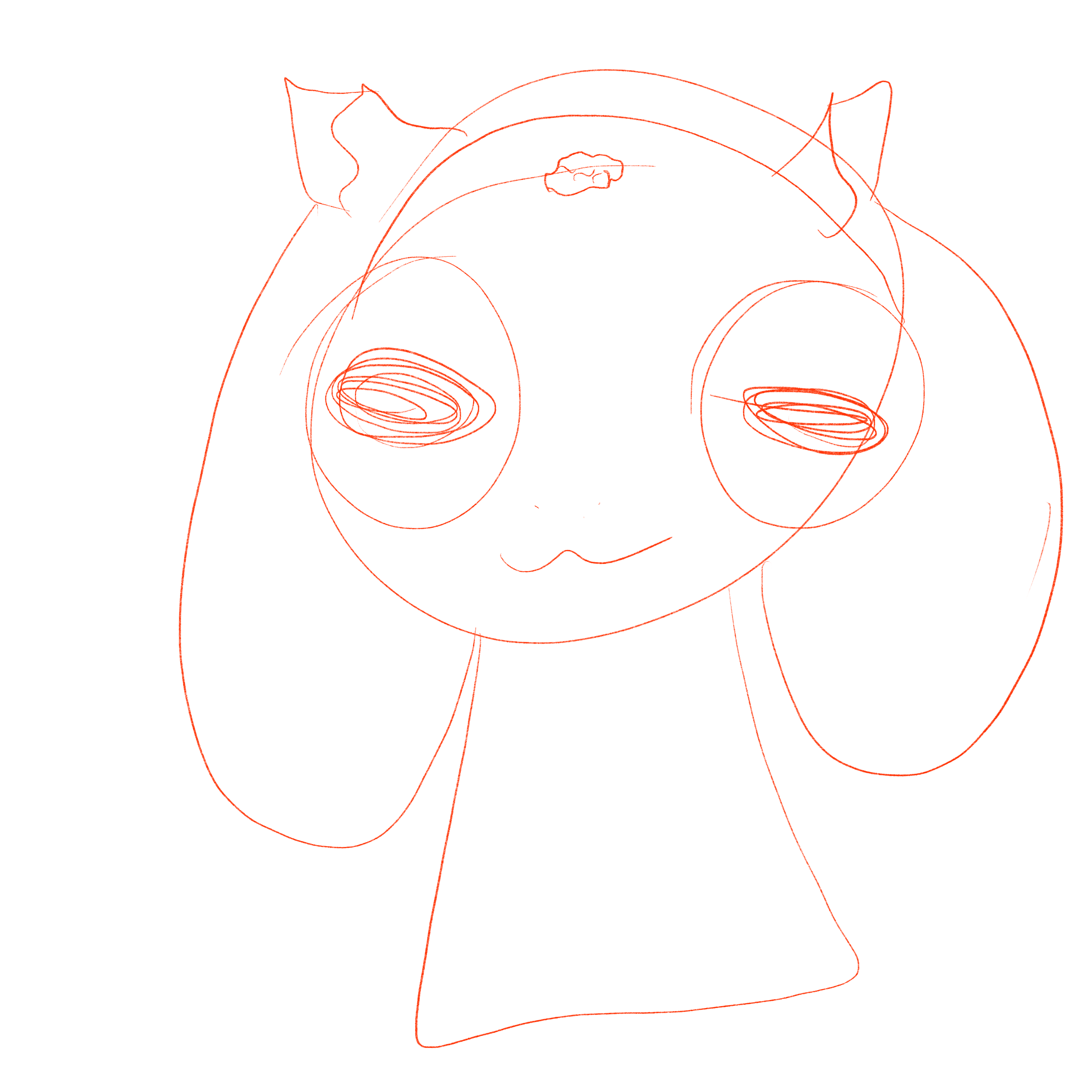
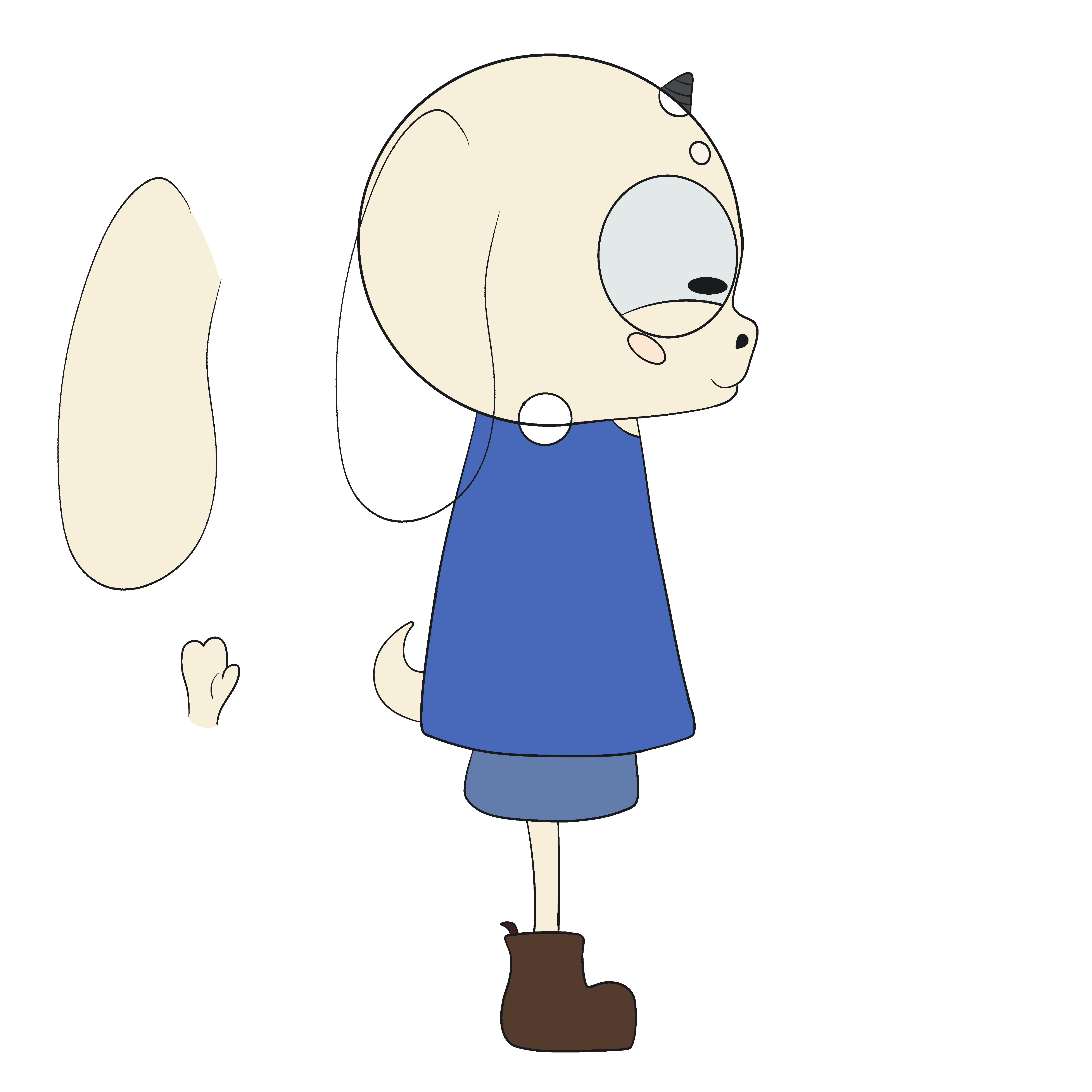
AAA WHAT IS THAT SIDE VIEW?! Sketches are scary!! ;-;
I began playing with the colours as I thought they were too saturated for this art style. The first is Smudge with the original colours taken directly from the brief image, the second is more desaturated but when we agreed his original fur tone would be better, it washed him out, so the third image was me working with the colours to get the perfect combination

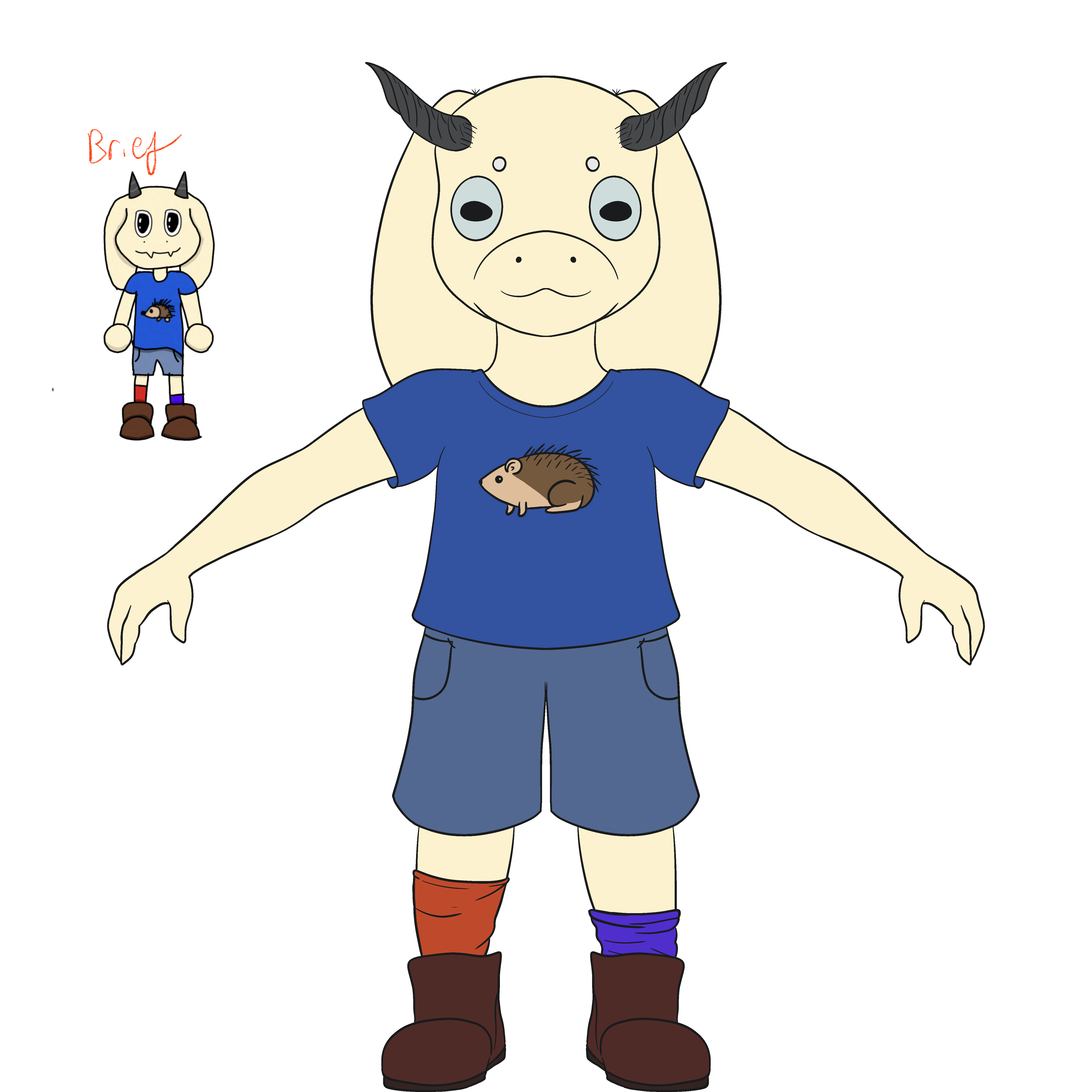
I used a piece of art I already made as my reference for I wanted his anatomy to look. I set him wider and made him more cutesified with a bigger head and big eyes, got some nice linework done...
Then we scrapped the entire re-design, looking for something more distinctive in style. We decided on this Charlie and Lola meets rubber hose animation meets 50s bright pastel, and many people said he was very cute and looked (and I quote:) Marketable. Marketable is good.
(And accurate, I want a plush of this so bad...)
We tried a few times to get the hedgehog on the shirt, but no matter what we tried, it was just too detailed. So instead, we decided to pay homage to Banksy's Love Is In The Bin by having a heart balloon instead. I have recently learned the hedgehog was an homage to Sonic, which is adorable. Thanks for clarifying, Astra :)
I don't know the thought process that went into the design of Smudge, and I don't know why he's dressed the way he is. I just did the work I was told to, and verbally offered a few changes, but honestly, Smudge is a wonderful design and I really enjoy him in this new style.
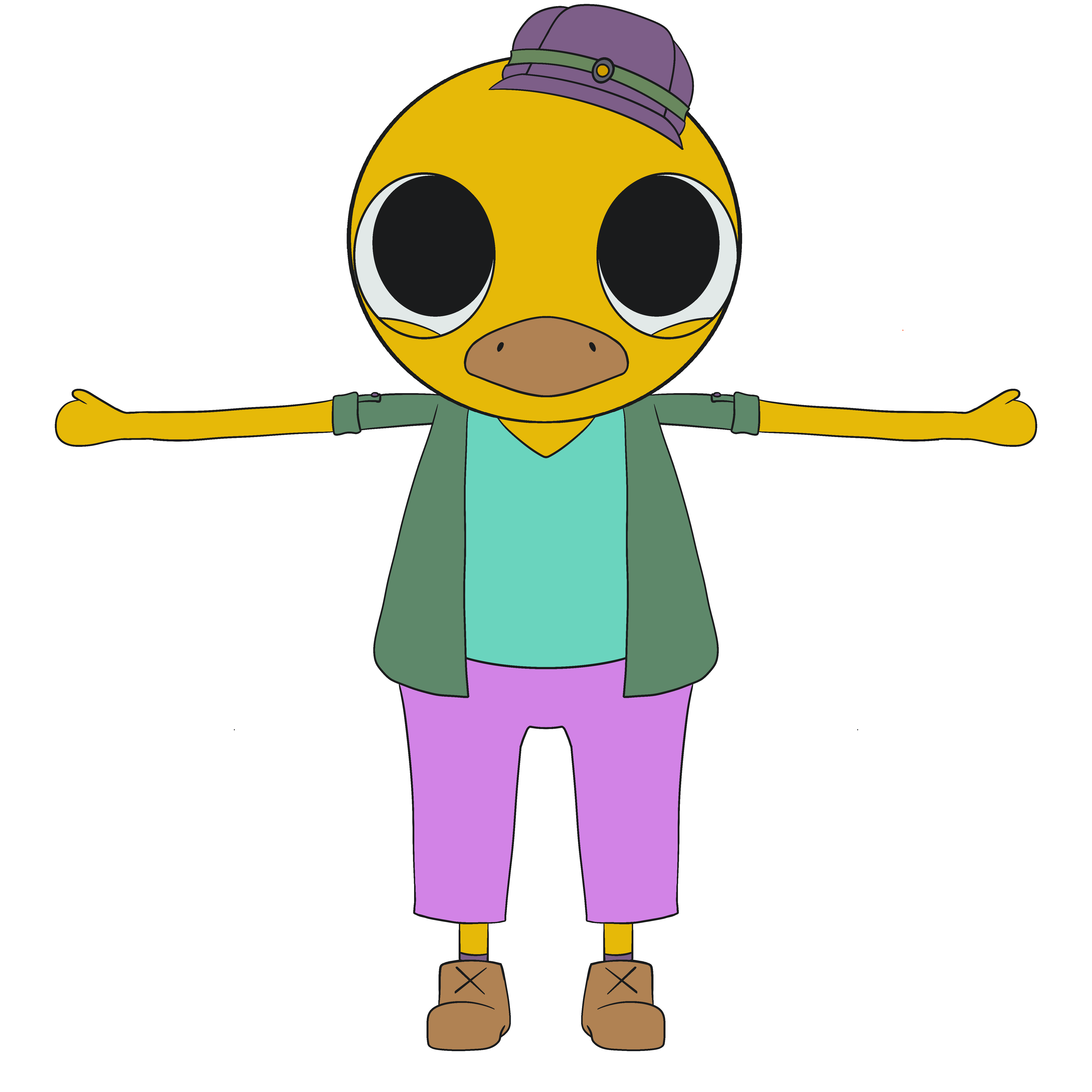
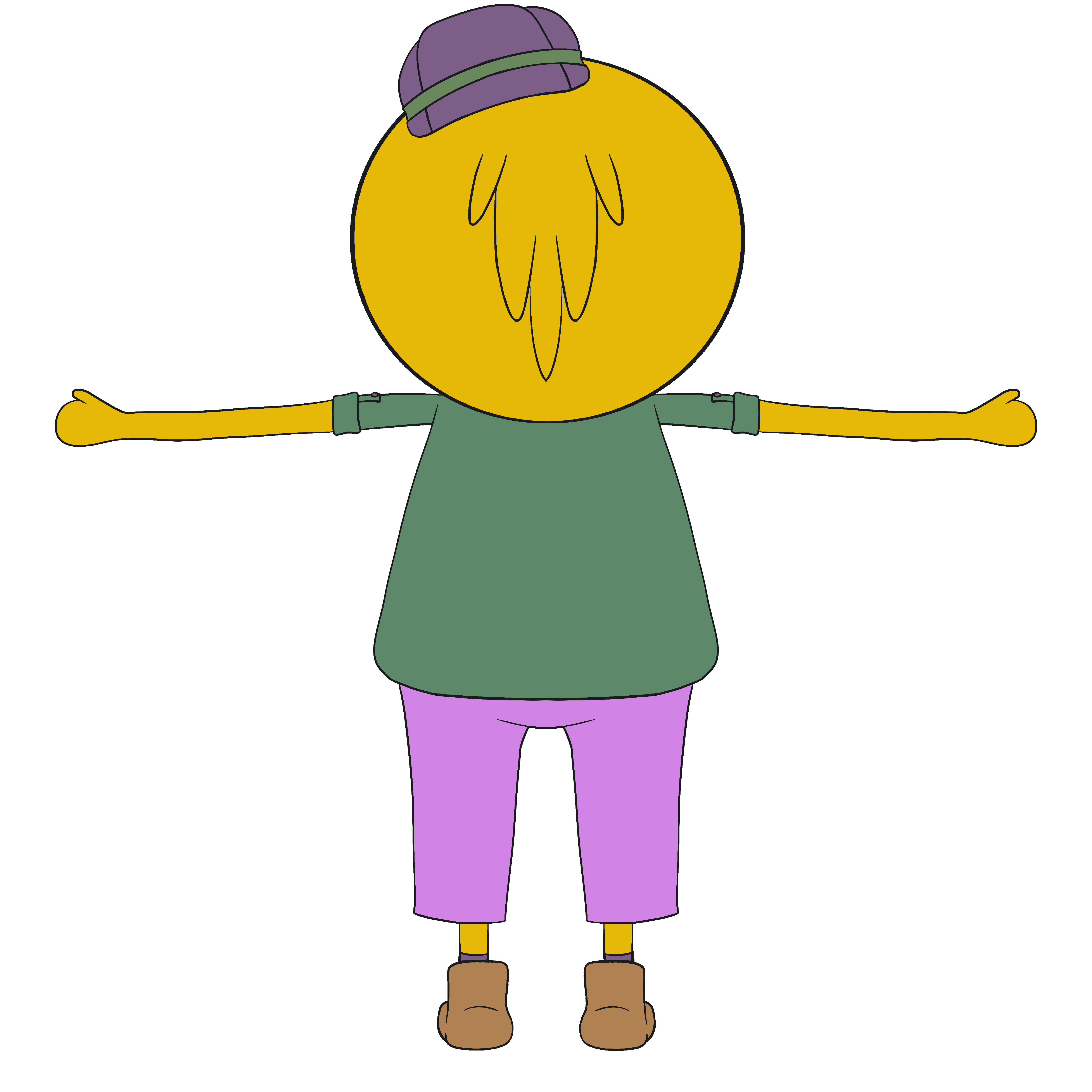
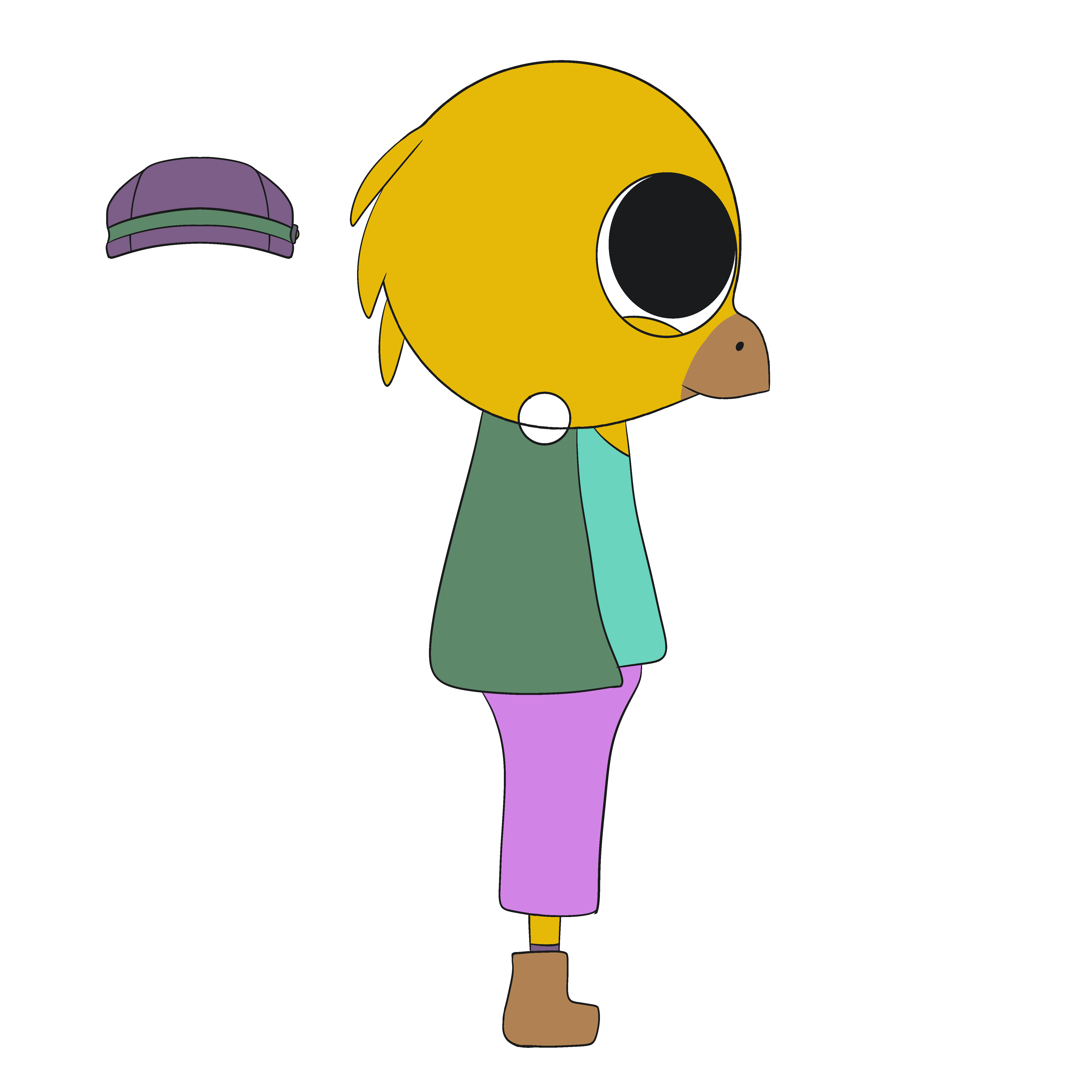
Canary.
Next, we agreed that Smudge should have a tour guide while in the mines, so this canary was created as a nudge to the coal mine canaries who were adored by their miners. I was torn between a Gloster canary and a Fife canary for the design, but apparently nobody liked the nerdy bowl-cut having Gloster as much as I did (and thought would be good to look like a miner's hat), so we went with a Fife with a little hat on, which is basically a sleeker visual of a domestic canary. I could talk about birds all day which would just turn this site into a bird blog (no joke) so lets try and keep to this particular Little Guy.The pink is due to the Red Factor cross breed of canaries that I also liked but doesn't have the classic yellow plumage for easy non-bird-fan players, and the green is because I wanted blue but decided to try and keep blues away from characters that aren't Smudge*
Originally, this character had pink shirt, green jacket, and blue jeans, then I swapped the blue for teal, then the trousers for the shirt. I like it and nobody had a problem with it, so that's what we've gone with
The canary was the easiest design in my mind. I wanted them to have the vibes of a miner, tour guide, and professor all rolled into one, and I have known a professor or two with loud clothing. I added the hat with a light because it just makes sense for someone to have in the dark, and it's at a jaunty angle because... well why not? it was genuinely a random design choice, likely influenced by cute characters in animation. Initially I was thinking of making a plaid or tartan jacket but I don't actually know how adding textures works in 3D, and I prefer the more simple colours anyway.
(*I know, the lizard, we'll get there, promise!)
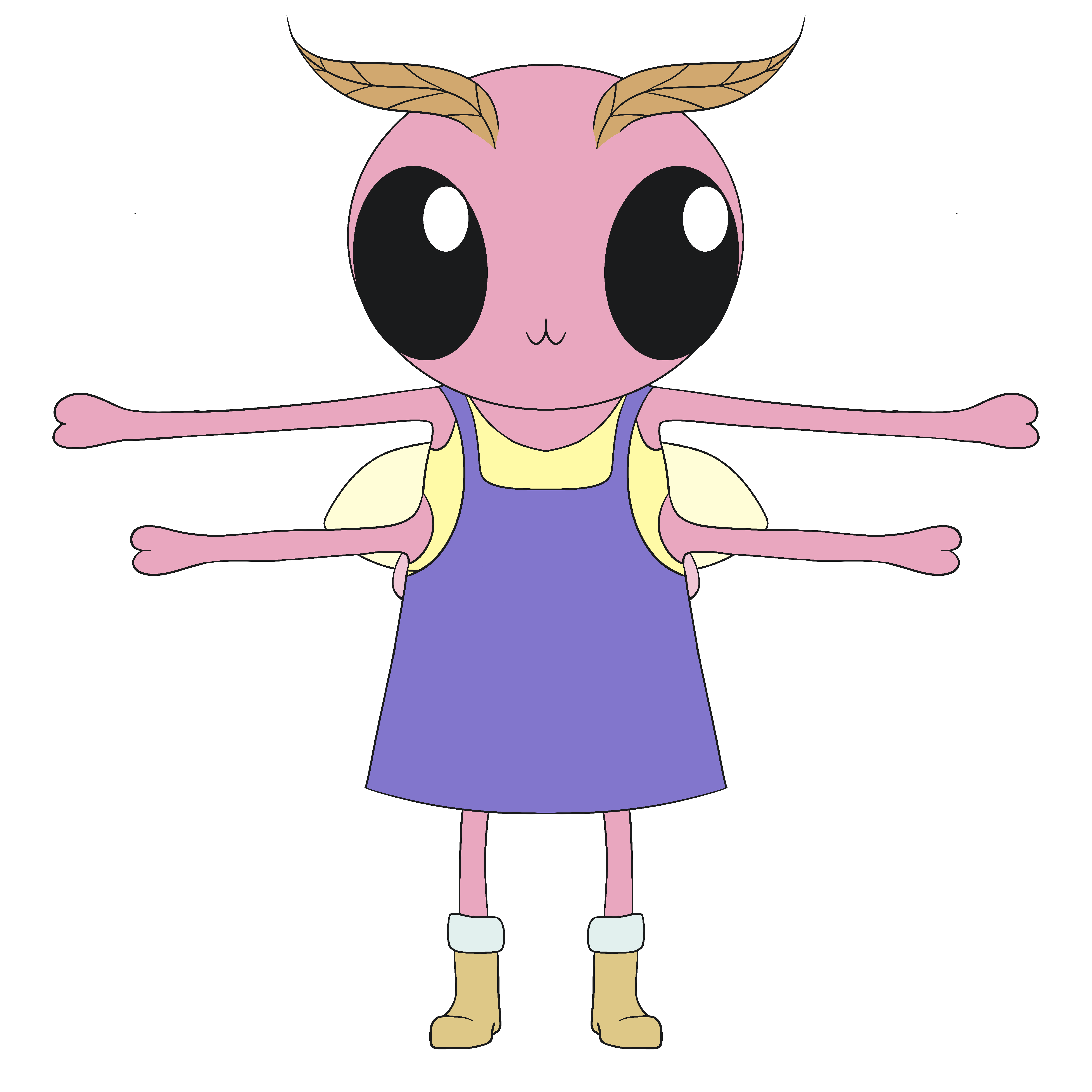
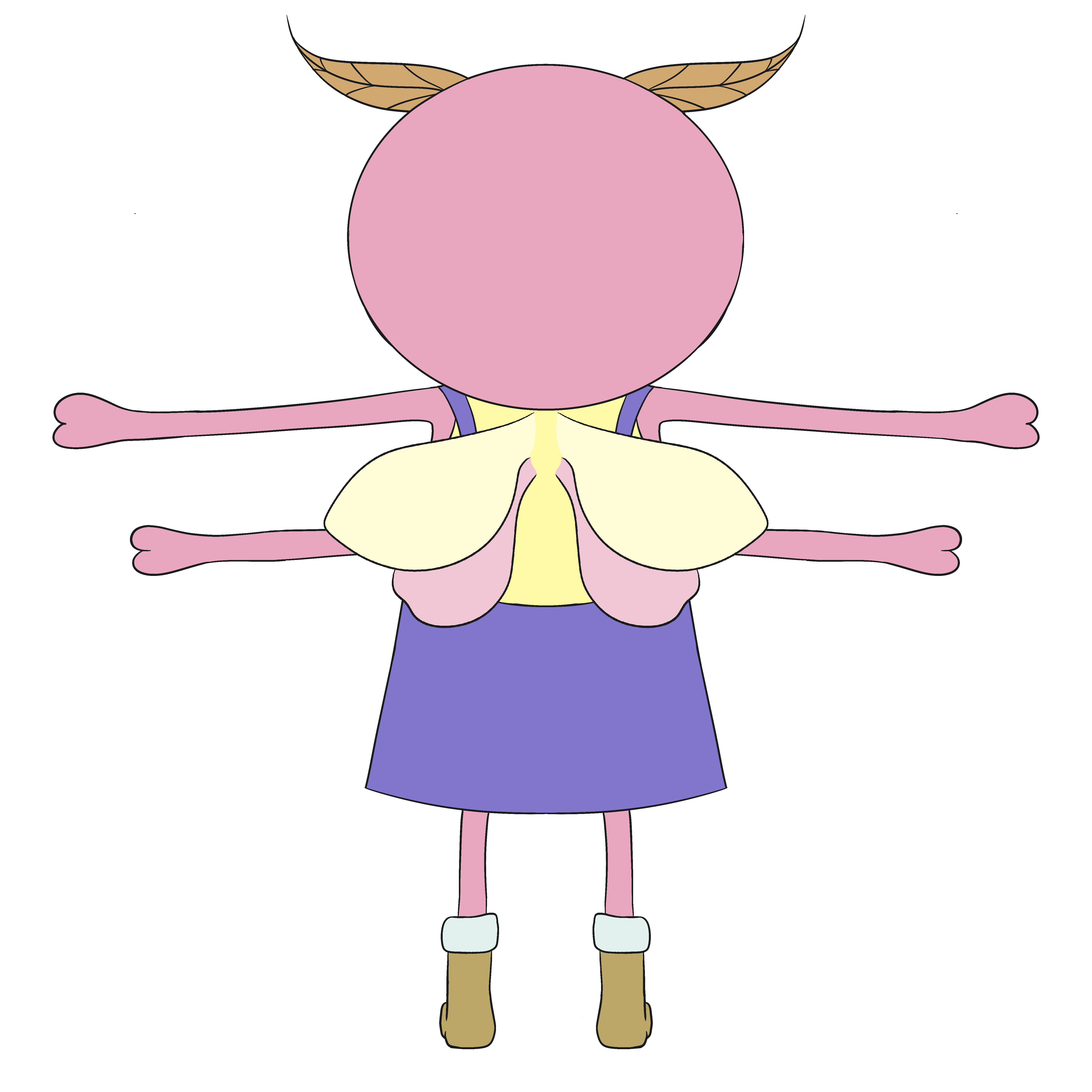
Moth.
After that, I wanted an invertibrate. Butterflies, as beautiful as they are, have terrifying faces, so I decided on a moth. They are based off a Rosy Maple moth, which I chose because I think they're cute. Everyone agreed the colour scheme works with the style, so we made the boots smaller and with extra fluff because Rosy Maple Moths are rather fluffy. I also had the dungaree dress because it seems easier to move in if you have more than the average limbs for a vertibrate, and I chose the yellow for their undershirt because I wanted the brighter yellow associated wioth rosy maples as well as the more pastel one on their wings. The purple is complimentary to the yellow, and we used these to make it stand out a little more, too.This character might not get used outside of being a background character, but I'd like if they could give quests
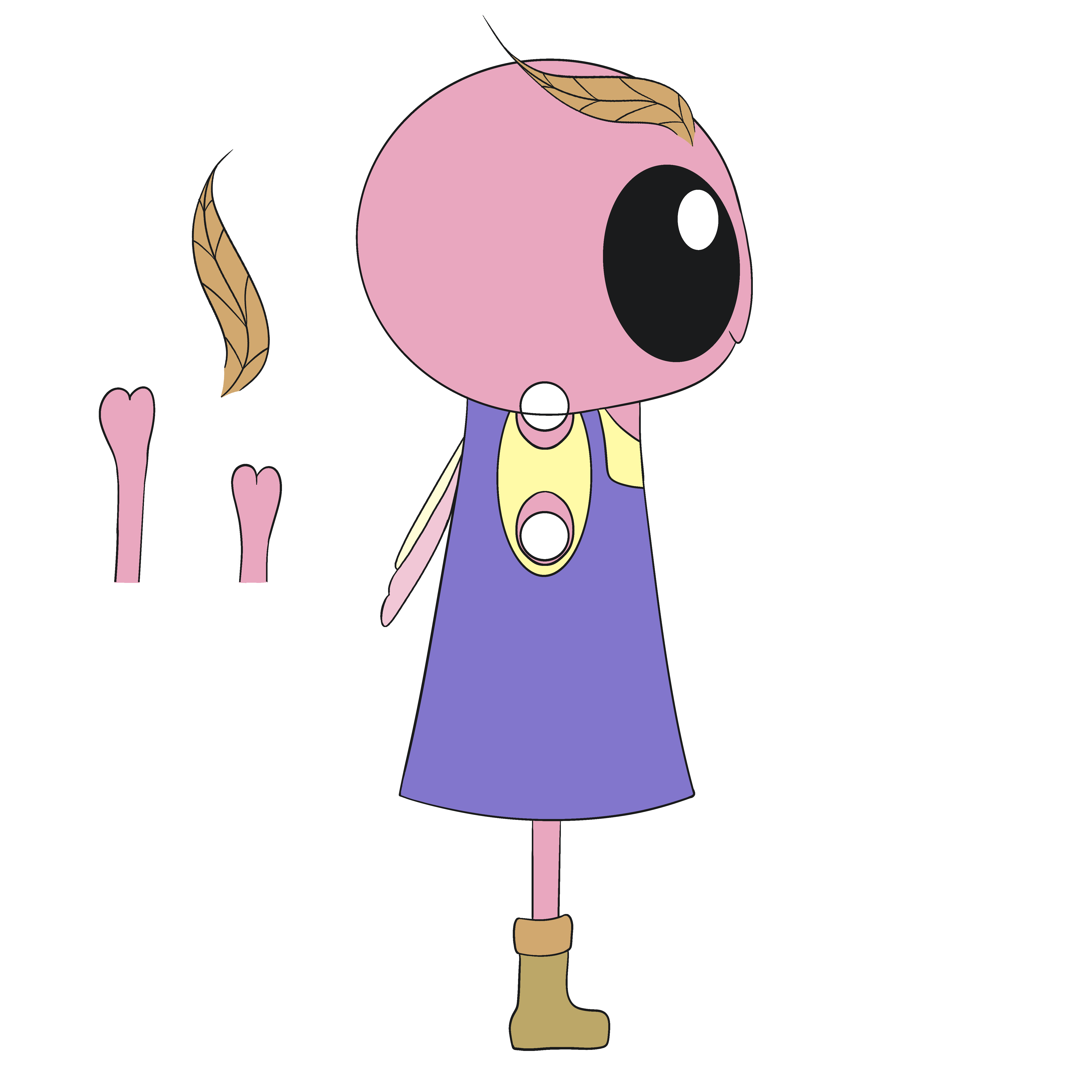
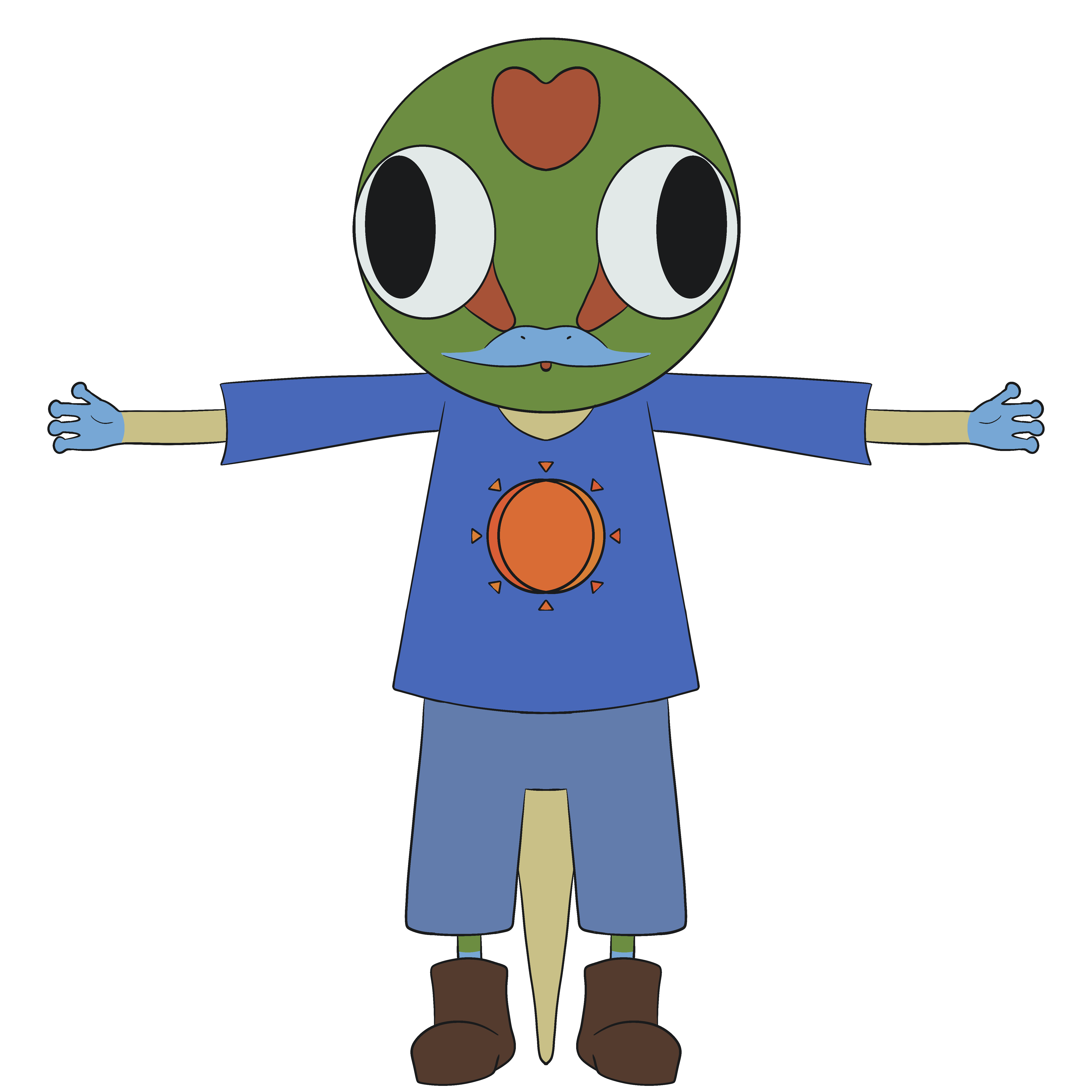
Gecko.
Finally, we realised Smudge would have no reason to go from location 1 to location 2 except gamer curiosity, so we figured what better way than to have (spoilers!) the main antagonist mind control another little guy? A little guy that doesn't have a single brain cell, no less! I based his colours on a Gold Dust Day Gecko. This was an interesting choice, as we wanted a more deceptive creature initially. We asked around and were met with 'cat', 'snake', 'fox', and other similar stereotypical animals. I didn't want to give more negative attention to these, so I decided to chose something more (for lack of a better term) brainless. In the initial sketch for the gecko, we tried for a chamelion which quickly changed to an iguana, then I thought 'why not a gecko?' because they're pretty harmless and very adorable. Lizards can look in different directions and in animation I've noticed that many unintelligent characters have eyes that point in different directions, so we stuck with that idea and got... whatever this thing is. I love them so much.I used similar colours with both the gecko and Smudge's clothing to make that seem more trustworthy to players while the main antagonist is using Smudge's good nature against him. This idea came from the real human brain favouring similarity, so if someone looks like you, surely they're like you, and you are a good person. The sun is a reference to being a Day Gecko (thanks Paul!) and his blues are barely altered versions of Smudge's colours.
yes there is a moment where I try to do a marx brothers disguise bit. It looked terrible.
Here's a couple of doodles during concept and for fun while discussing bits of the plot: